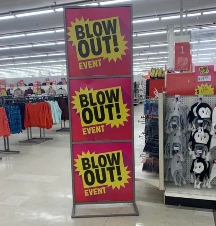
Well it’s that time again…a free issue for all readers! The paywall will be back next week, but I wanted to take a short break from it to allow everyone to be able to read an entire issue (and hopefully subscribe to our premium version for only $10/month or $100/year). As some of our social posts state:
“Is one great idea worth $100/year??”
We think we provide several great and actionable ideas to help grow your top and bottom lines in every issue, never mind every year, and hopefully this free version will prove that to be the case. If you agree, please subscribe to our premium edition here (the ROI is killer good):
Be sure to scroll down and check out my quick take on why Amazon is failing a physical retailing!
Sponsored Content
There is plenty of discussion about retail pricing of late, most of it tied to inflation. Given the challenges posed by cost increases and if / how to pass them along to customers, I thought it would make sense to cover the psychology of pricing and related pricing tactics. While these certainly will not mitigate the inflationary pressures we are all feeling, they will help you best position your products and prices to maximize sales and margin.
So what is Psychological Pricing?
Psychological pricing, as you might expect, leverages human psychology to make your prices and thus your products appear more attractive to consumers. We all know that humans do not always act rationally and that creates an opportunity for creative pricing to impact behavior. Certain prices and price presentations can be more appealing to shoppers. Believe it or not, if you want to make your store’s prices more attractive and compelling to consumers, you do not necessarily need to lower them.
Every customer perceives items, prices, and value differently, and many of these perceptions aren’t even conscious. Most buying decisions are not meticulously thought through. Typically the buying process involves snap judgments and decisions, and that’s where these psychological factors likely come into play. I say “likely” because, despite significant advances in brain research, the factors involved in perception and decision making are quite complex, individualistic, and therefore still not well understood.
Choosing the Correct Strategy
When considering various pricing strategies, be sure to select the one that is best aligned with your brand and product offering. For example, a luxury offering may be negatively impacted by odd-even pricing as it could devalue the perception of your products. In fact it might actually hurt the product by making it appear cheap. In such a case it would make more sense to employ prestige pricing, which will actually boost the product's image as a luxury item.
Pros and Cons
Psychological pricing allows merchants to influence the way consumers perceive and purchase products without even changing the product itself. This creates tremendous flexibility to impact sales in a very cost-effective way. But, as always, there are pros and cons to how you utilize psychological pricing.
Pricing is generally arbitrary. There’s no real reason why a watch costs $50 or $1,000. There are no tried and true rules. But there is a bunch of research and history that can lead all of us in the right direction. Consumers will ultimately decide if prices as fair or unfair, and that will typically be an intuitive decision. By using one or perhaps more of these psychological pricing strategies, you can impact those decisions.
Rather than a deep dive to define each possible pricing strategy, let’s dig in to how to use some of them in real life. Each of these tactics are scientifically proven to work, you just need to determine which makes the most sense for your business.
1. Go down by a penny
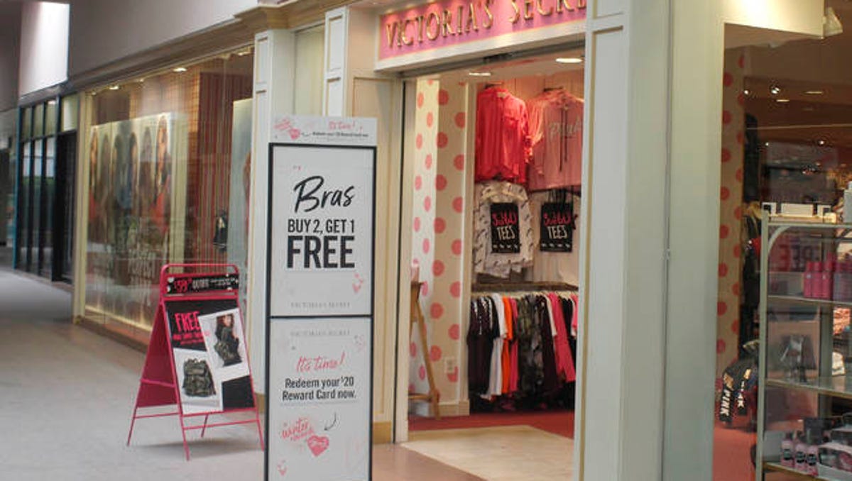
An oldie, but don’t take it for granted. “Charm” pricing makes shoppers perceive anything as less expensive is when you reduce the left digit by one (most often when you break a price point, as in the photo above, versus going from $2.80 to $2.79). Customers read the price from left to right and perceive it as “high” or “low” before we even get to the “.99” portion, so seeing a leading “2” in the image above rather than a “3” is a win. By the time they get to the “.99” portion, it’s too late to change their perception. The brain works quickly! Here are two additional ways to make this tactic more effective:
Print the “.99” in smaller letters than the dollar portion. This further reduces the importance of anything that comes after the left digit.
End prices in a “9” rather than other numbers, as research shows that the use of “9” price endings increases demand.
2. Use fewer characters
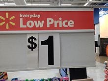
Customers are more likely to purchase a product when the price is shown in a simple manner. In the image above, $1 is better that $1.00. The impact may be even better on higher retails. For example:
$1,799.00 is a complex (bad) price.
$1,799 is a step in the right direction, but...
$1799 is even better and will be the most likely version to convert a customer. Yes, a comma can make a difference.
Believe it or not, you add further impact by reducing the number of syllables in a price. The more syllables a price has, harder it is for your brain to process the number, resulting in a perception that the price is higher. So, $14.74 may be perceived as a higher price than $14.80 (even though they are printed with the same number of characters) because of the extra syllable.
3. Kill the dollar signs
This ties to both the logic above and has been shown to have some standalone value. Some studies have shown that if you remove the dollar sign, people will perceive the price to be lower, and, therefore, purchase more.
4. Keep your fonts small but visible
This one is a surprise, but you can read a study supporting this theory here. It’s clear that our brains do not always work in rational ways, and in this case people are more likely to perceive a price as low when it’s written in small font. What the heck!
5. Use rounded numbers, maybe
This tactics depends entire on your brand and the related messaging you want your guests to see. If you are a premium seller, and want to emphasize quality over low prices, this may work well for you.
Many shoppers believe that the higher the price of a product is, the higher the quality will be. Despite this, they expect a fair price. As prices escalate into the world of being considered “expensive”, customers may become concerned that those prices might be artificially high (how does one discern between $2,000, $2,300, and $2,500 for example when judging what is a fair price?). Here is where rounded prices ($65 vs. $64.99) can make an impact on how the consumer’s brain reacts to your offering. Here is the good news:
Rounded prices ($30, $70, $100) are understood more easily than non-rounded prices ($44.97) and work better for emotional purchases;
Fully rounded prices (e.g., $300, $2,000) can be perceived as artificially inflated prices given the apparent simplicity of the price point (“did that retailer just make a $180 item $200 to make an extra $20??”). So stagger your prices for emotional purchases using rounded prices. It’s better to use $110 or $90 as opposed to a $100, as the latter feels a bit random.
6. The words you use make a difference
Persuasive language can help frame a customer’s perception of your pricing. Describing something as “the cost of a cup of coffee,” is called price framing. It takes the customer’s mind off of the price itself and refocuses it on something they frequently purchase without hesitation like a cup of coffee.
Believe it or not, other examples of price framing are the classic “as low as $XX” and “only $XX”. Both make the featured products seem lower cost and both work. Are you using them enough?
6. Use anchoring
Anchoring is simply providing a base example (“an anchor”) which customers can use to compare other prices to. It’s common for shoppers to rely on these anchors when making purchase decisions.
In actual use, the anchor is typically the first price shown. For example, when you enter a shoe store, and the feature table shows a pair of running shoes at $199, and then shows a similar but lesser brand/quality next to them at $99, that pair will will be more likely to be purchased as it’s typically perceived to be cheaper.
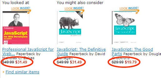
The same impact is gained by showing was/now pricing. Include a former, or “compare at” price, crossed out, and then show the actual selling price. The former price is the anchor and will incentivize more purchases than if you showed only the selling price.
7. Decoy’s work to upgrade average unit value
Simply put, the decoy effect leverages the following theory. When there are only two options presented, consumers tend to make decisions according to their personal preferences. However, when they are offered a third “decoy” option, they are more likely to choose the more expensive of the two original options.
An example could be be offering a basic laptop that costs $1,499, a good laptop that costs $1,799, and a slightly better laptop that costs $1,999. If a customer is already consider buying a MacBook, they will often go for the $1,999 model as it offers twice the storage for “only” $200 more.
8. Use the word FREE
There are a handful of words that most merchants agree are very powerful in impacting consumer behavior. The word “Free” is either at the top of the list or pretty darn close. Customers have been proven, time and time again, to react, perhaps overreact, to free offers. The word free creates a near immediate perception of value for the shopper, and typically results in purchases at much higher levels than normal.
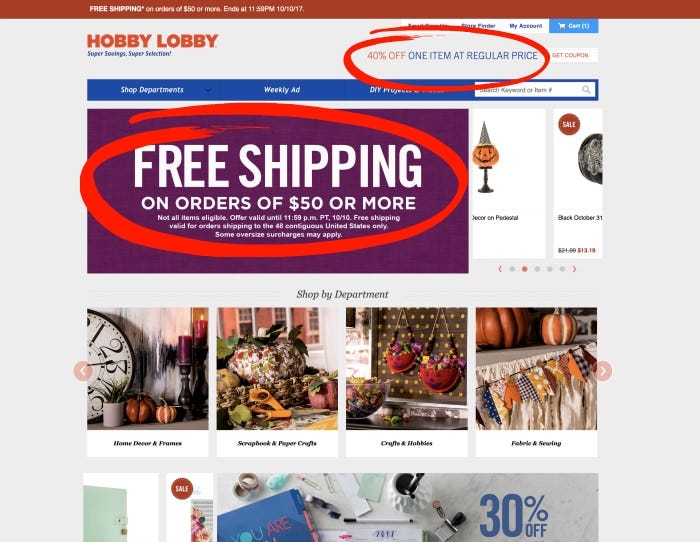
Another way, beyond pricing itself, to leverage the impact of the word "Free", is to offer free shipping for online orders. Studies have shown that free shipping has a greater impact on the perception of an offer than a price discount of equal value. It may not be logical, but it works.
Pricing is a challenging, complicated, and powerful element of your marketing mix. While there may not be any perfect solutions for your specific business, the tactics above have been proven to work time and time again. Try, test, analyze, and jump all over what move the sales and margin needles. Pricing is simply a lever than should not be ignored.
Sponsored Content
Quick Take: Why is Amazon Exiting Physical Retail?
Amazon announced recently that it is closing its 68 book, 4-Star, and popup brick and mortar stores. This announcement does not impact Whole Foods or Amazon’s new fashion concept, but it is still a significant step backwards for their physical store initiatives.
So is this decision an indictment of physical retailing?
Absolutely not! Frankly, this end result is more a reflection of Amazon’s inability to create and operate compelling stores than anything else.
In visiting all of these store concepts over the years, I was always left with the distinct impression that the design, offering, and services were basic and unexciting at best (other than their “just walk out” cashierless technology, which is killer good). In discussing these concepts with friends and coworkers, I often asked “what makes them special?”, and the answers were few and far between.
So why has a company as innovative as Amazon struggled with their physical stores?
A few possibilities:
Physical retail was a “step child” and was never given the focus needed to make it innovative and worthy of growth. Between the scale of online and AWS, retail was a mere blip on Amazon’s priority list. It seems a “retail merchant prince/princess” (a term often assigned to Mickey Drexler for his success at Gap) was needed and was not there.
Amazon was its own worst competition. Their stores offered many of the most visible items from online, they presented very little in terms of new and innovative products, and it most cases I knew I could order items presented in the stores online whenever needed. Online ordering and delivery is so efficient I saw no real reason to make a purchase in store.
Because Amazon rarely showed compelling presentations of newer, fresher, less visible online products, the impulse nature of purchasing never kicked in. Unfortunately this extended to even seeing an item in the store and becoming incentivized to buy it online. Nothing they did changed my behavior.
Certain items, even if well known, could have benefitted from bringing them to life in the stores (think B8ta). Demos, videos, try-me opportunities, etc. were underutilized. Show me the features and benefits of items like the Echo, Fire Stick or Ring system and I may have learned something and become a potential buyer. But this did not happen.
The stores generally tried to do too much, in terms of product selection, in too little space. No offerings were dominant and even when you think about effective curation, very little stood out. Sharper Image and Brookstone suffered from the same issue.
Physical retailing is different than online selling. The tactics involved in bringing customers to and in the store, traffic patterns, guest service, driving higher UPTs and AOVs, physical presentation / maintenance and more often require training and focus that does not necessarily match what is done for online selling.
Retail News You Can Use:
How Strategy and Psychology Work Together to Perfect Pricing (well, almost)
Five Ways to ADAPT Pricing to Inflation
Ecommerce Habitues: Women Are TakLess Time From First Visit To Purchase
Walmart Rolls Out a Tech Tool to Help Shoppers Try on Clothes Without Actually Trying Them On
Five Popular Trends For Every Specialty Leasing Program
Great Feats Require Crucial Decisions
Three Unusual Questions to Make Job Candidates Think
Cool Pics:
Quotes of the Week:
“Find the right price for an irresistible offer, which, by the way, isn’t necessarily the lower price.” - W. Chan Kim, Blue Ocean Strategy
“A merchant is someone who figures out how to select, how to smell, how to identify, how to feel, how to time, how to buy, how to sell, and how to hopefully have two plus two equal six.” - Mickey Drexler


